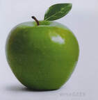
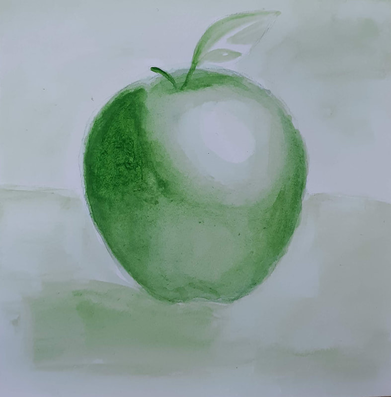
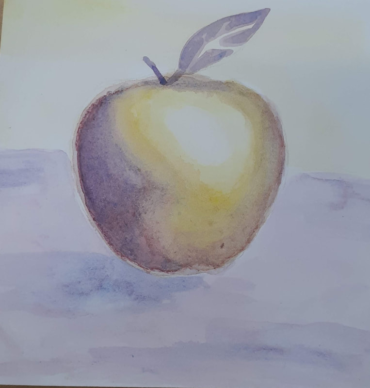
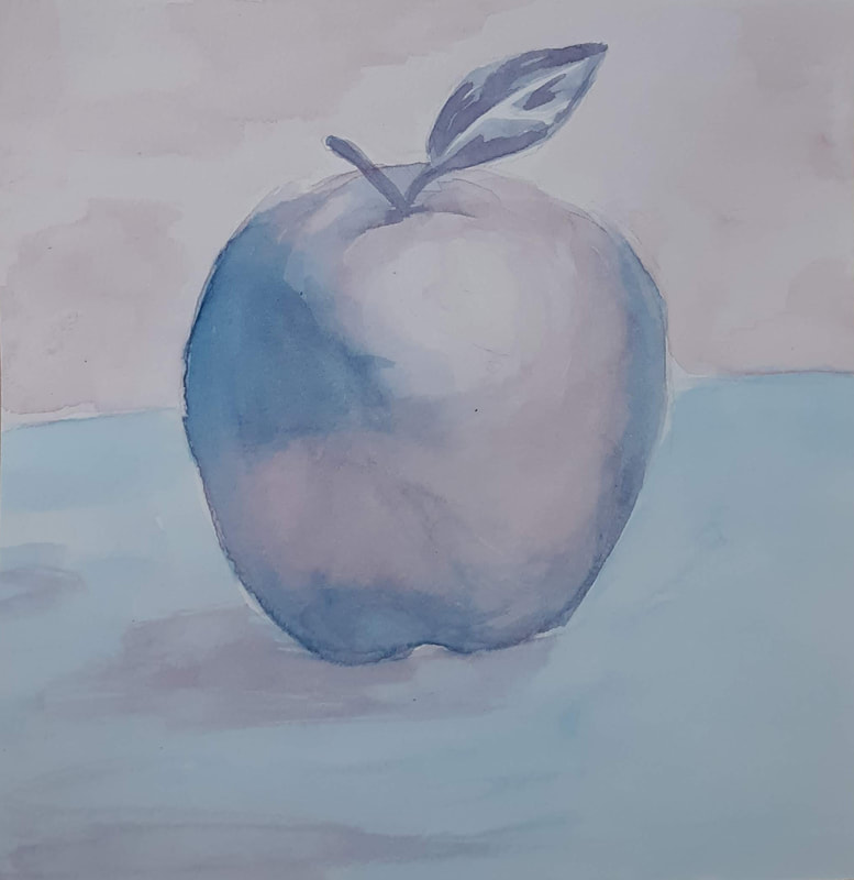
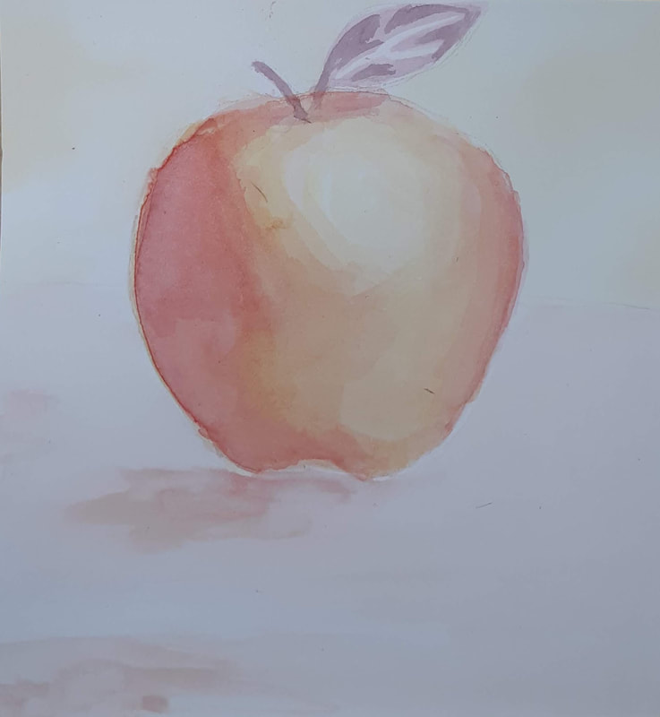
 In this practice, I had to mix colors and play around with washes. My first apple is monochromatic, and the paper started to pill up a little as it did with the next one, which was a complementary color scheme. One thing I can do to combat that in the future is work in lighter washes, and leave more time to dry in between each. Monochromatic is always a good practice no matter what the medium, because you are forced to look at the lights and darks and really know where to put them in order to create the illusion of space on a 2D plane. If I were to do this again, I would have pushed the mid-tone a little more, as I feel like it's lacking and therefore takes away from the 3D illusion. The warm and cool color palettes were my favorite to do, especially the cool colored one, as I feel I did the best in creating space and also I feel like it looks a little enchanted.
0 Comments
Leave a Reply. |
Archives
January 2020
Categories |
 RSS Feed
