|
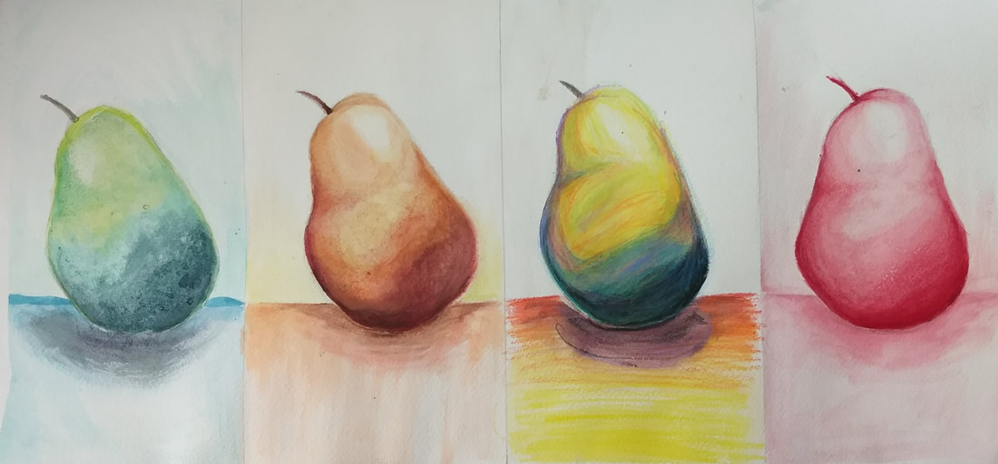
My favorite medium this year was watercolors. This surprised me because I usually hate watercolor as a medium because of how out of control you are over your art. The guest artist that came really showed me that watercolor doesn't have to be this rigid, sort of art-school type medium; you can do things with it that I've never seen before! Having that experience of a new technique to an old kind of traditional practice really opened my eyes and I ended up having so much fun creating the final watercolor piece. Before, being out of control was hindering, but in that project it was an asset and it's what made each piece unique and fun to look at. Not only that, but I ended up really enjoying working with watercolors in the more traditional sense with the fruit project, especially the one with the watercolor pencils! I'll definitely explore this medium in the future.
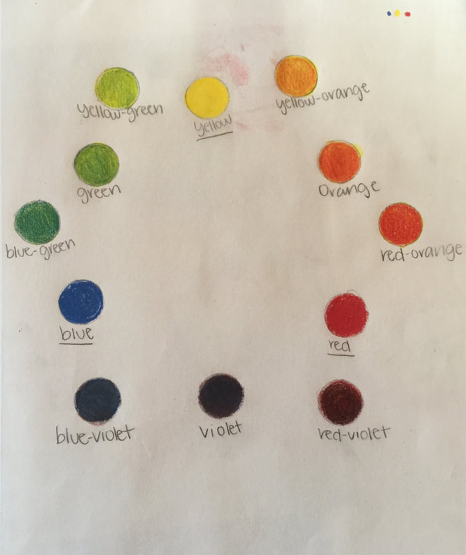
I chose Sakshi's landscape in the style of an artist. Her palette is beautiful, and they really pop against the black background of the painting. Somehow it is both abstract and not; combining her artist Jean Michel Baquiat's graffiti style with the real world. It all fits together so well. I would have never thought to use a palette knife to emulate graffiti on a wall. She mostly uses primary colors and grayscale, which is a nod to the lack of colors this artist probably had because he worked with a limited collection of spraypaints. Her composition is exciting because nothing in her piece actually touches the middle, veering slightly to the left or right. Here is her blog link: https://sakshi-apex-2020.weebly.com/  Two practices I feel that helped me the most with the medium is the pen and ink landscape and the prismacolor wheel. The pen and ink landscape was tedious work and it was not fun while I was doing it, but it ended up helping me tremendously with the final pen and ink piece because I had so many texture options to choose from that I already knew how to draw. All the textures in my final piece ended up being off the sheet, so it was an incredible help. It saved me the worry of having to plan my textures- they were already planned!The prismacolor wheel was very helpful for me also because prismacolor was a new medium for me, and I didn't understand how to mix the colors and what burnishing meant. With the color wheel, I could mix the colors just right without potentially ruining my project. I didn't end up using burnishing a lot in my final prismacolor project but it's nice to know I could've because I knew how to. I'm glad I got that practice in before I had to create a whole final piece with just three colors! I feel as though enough instruction was given for the students to create wonderful pieces and I appreciate the fact that you taught us so well before letting us start our final pieces.
I think my weakest project was my pen and ink project for multiple reasons. One of the reasons was that it was the first project, so I felt a lot of pressure in making something good and honestly I was a little nervous. Also, I ran out of time at the end and had to rush the stippling on the plate. I feel like if I had managed my time more wisely, I could have added a lot more depth to the piece from adding and intensifying the stippling. I also feel as though the composition could have been done better in some way, like changing the perspective of either the plate or the sushi, or zooming in so the top sushi was cut off a little so some pieces of sushi wouldn't look so awkward. I feel as though I've grown a lot as an artist since the beginning of this class, and if I had the chance to do it again I would do it more thoughtfully. 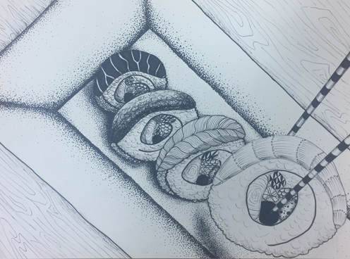
0 Comments
|
 RSS Feed
