|
This class was such a blessing to have taken. I learned so much about myself and my art through this class. I gained technical skills in acrylic, as shown with my self portrait, where I learned to balance lights and darks to make the piece more appealing. I leaned into my illustrative side on the Interior Spaces and the tarot cards and pushed the boundaries of my personal style. At the beginning of the class we did a prismacolor piece, which is one of my weakest mediums, and I learned techniques and skill and vastly improved my ability in that medium. You can compare that to the self portrait in prismacolors I did in Art 2, and you can tell what a difference there is. I loved seeing my peers interpretations of the prompts and it was amazing to watch them grow and change along with me. There is such a community of passionate artists all around me and I am very thankful. The palette knife painting in oils was a real struggle because of the large scale and the fact that I had to think of a creative color palette. I think I overcame that though, and I find the piece to be very successful in the end. So many of my pieces have started out shaky and ended better than I could have ever expected under the right guidance.
0 Comments
 My palette knife piece is one of my friend, whom most refer to as Marlena but few know her name is actually Weiner. Thus, I named this piece Ode to Weiner. It is a soulful and provocative piece that integrates the use of texture in the figure which is balances out in the smoothness of the surrounding blues. I decided to use warm tones to reflect the fiery nature of Weiner, who is a naturally wondrous human being. The background is made to look like she is submerged in the blue of the ocean, which counters the fiery nature of the foreground and thus evens the piece. If one were to see this piece not knowing who my lovely wife is, I would hope the colors shall show them what she is like, which is very happy and fun and in water.
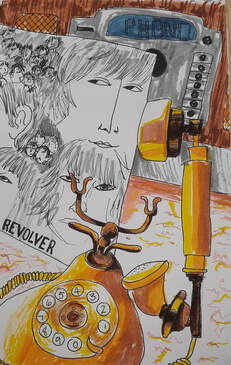
This piece is the piece that took me the longest to finish. I think out of all the ideas I've had this was the strongest and truest to the prompt. The prompt was ordinary to extraordinary, and I accomplished this by using an ordinary medium, aka index cards and marker, and the extraordinary aspect comes from the mystical value of the images on the cards. The origin of tarot cards in a mystical sense is actually a relatively new idea, popularized in 1909 with the creation of the most famous artwork now known as the Rider-Waite deck. What's interesting is that the artist was actually a woman, named Pamela Smith. It was still new for a woman to attempt something so well known, but it definitely worked out for the better because of the immediate popularity of both the art style and the cards themselves.
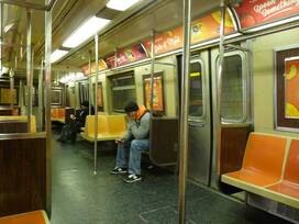
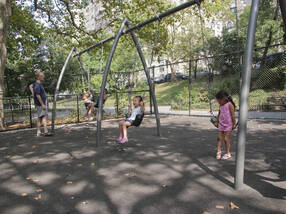
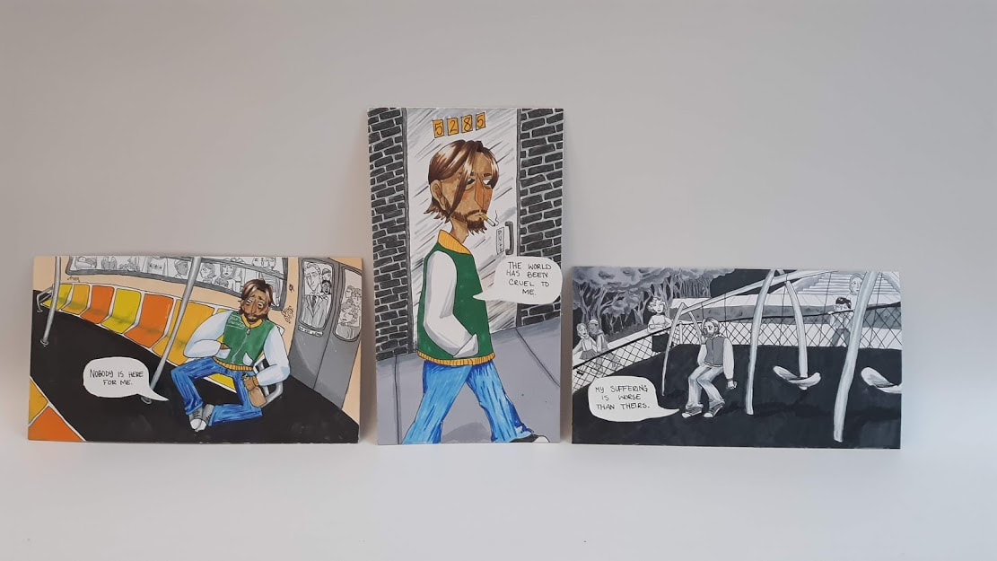 The Interior Spaces project was an idea that let me get inside the space of a human mind instead of a tangible space. This triptych is about the classic Everyday Narcissist who believes the world is spinning for them. They sabotage themselves and feel bad for themselves later. On top of that they want other people to feel bad for them too, but not too much: no puppy-dog pity. The scenes my character is in are scenes personal to me. The first is a classic NYC subway car which I spent a good portion of my early life, The middle panel is the side of a street and the numbers outside the door are the last numbers of my mother's phone number which has the (646) area code from the city. The last panel is the swing set from the park outside my grandmothers house which is Riverside Park on the Hudson River. The pieces get progressively more grayscale and he becomes assimilated into his background rather than standing out. This represents how he is no different than any of the characters in the background which are the same in the first and last panel of the triptych.
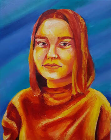
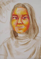
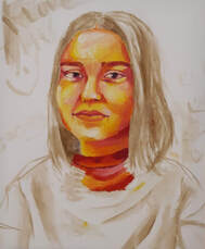
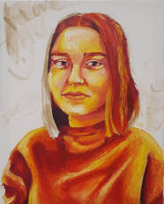
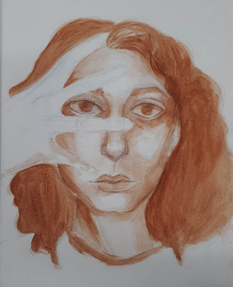
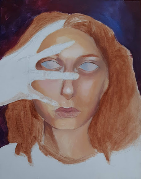
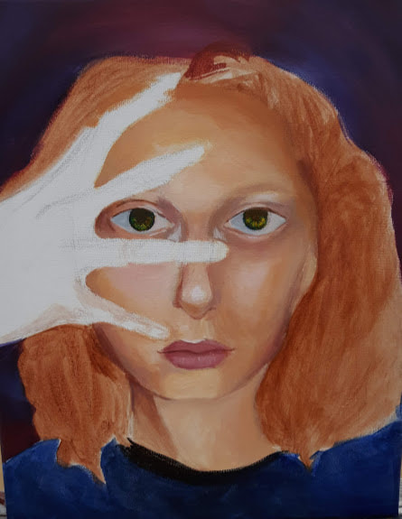
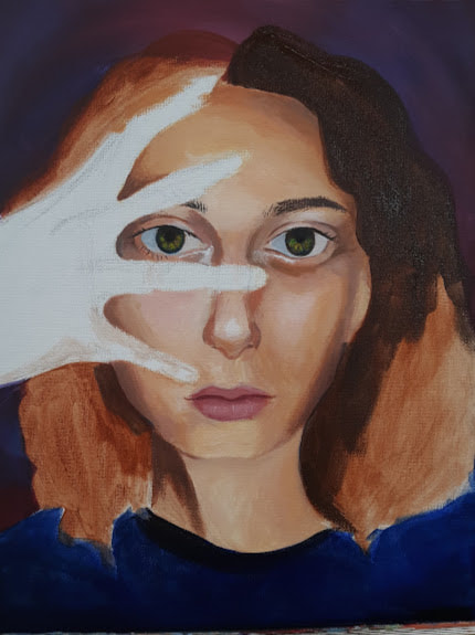
 This is the final self portrait piece. It's been a while since I've used acrylics in general, and it took me a bit of time to get into the swing of things again. The hardest part for me was the mouth, because I couldn't quite get it to look like mine even though it looked like the picture. I ended up redoing the mouth several times from scratch and I'm still not completely happy with it. I also have a hard time using a wide range of shades, because it's scary for me to go into the darker shades. To combat that with this piece, I just went in with the dark shades and tried not to think about it as I was doing it. You can see this on the shadows under the neck and the left eye. Overall, I really like the mood of the piece that comes from the expression and the dark shirt and background colors. When I look at this piece I feel like it's looking back at me, even through me.
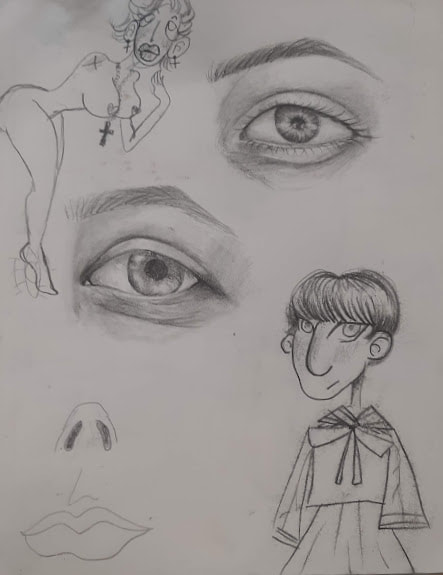
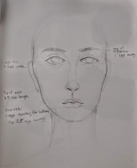
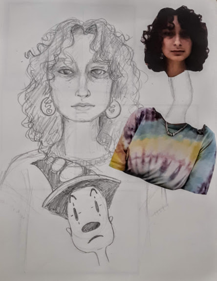
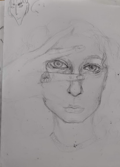
We started planning with just drawing features, as you can see in the first picture along with a drawing of RIngo and also a lovely lady. Then, we did proportions of the face. Next, we drew ourselves from pictures (featuring Koko the Clown), and the last picture is planning for the picture I used in my final acrylic.
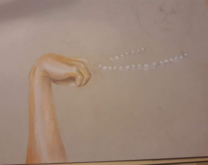
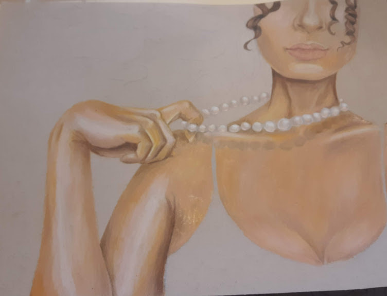
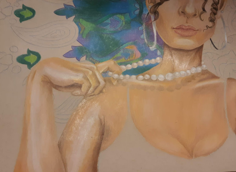
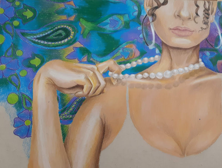
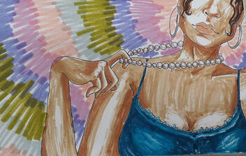
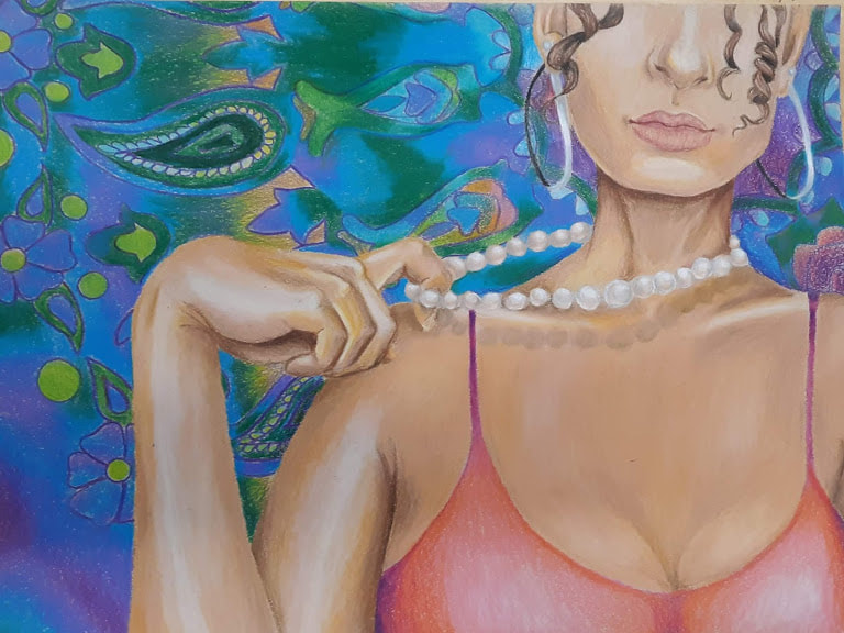 This is my finished prismacolor piece. The reflective part of my piece is the pearls, and I tried to show this by reflecting my skin tones into the individual pearls. The pearls I modeled with are my dad's mother's pearls, and she gave them to my mom when she got married. In this way, my piece reflects the beginnings of my family. On the other side of the spectrum, the background is a tapestry that I bought in Venice Beach, California in December of 2018. I chose this background because it represents my individuality in my family, and how even though I am a part of this great web of people, there is a part of me that is my own.
I am not a big prismacolor fan at all, and in the future I don't see myself using this medium out of choice. I have much to improve upon skill-wise, and it kinda shows. I do enjoy the vibrancy of the piece, and how the cools of the tapestry complement the warms of my skin and my shirt. As an artist, color is not my strong suit but I do find these color choices to be very pleasing.
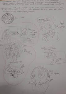
This is how the project started. The first picture is the initial brainstorming phase, which was more like an idea dump. I then refined it into two pieces and made 5 compositional sketches for each.
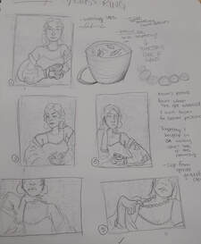
Mrs. Rossi then picked her favorite two compositions and I made 2 marker color sketches. Then, we picked the one of me holding the pearls as my final piece.
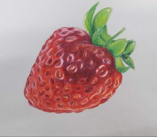
Choosing the strawberry was a terrible decision at first. I had never really used prismacolor pencils before, and the grooves and lights and darks forced me to look at the strawberry in a very abstract way. I think actually as I went along, even though it was really hard, I improved immensely from picking the strawberry. As you can see in my final piece, I went a little crazy with the shininess but i learned how to layer colors and burnish where I wanted to burnish and create depth through this exercise.
|
AuthorWrite something about yourself. No need to be fancy, just an overview. Archives
January 2020
Categories |
 RSS Feed
