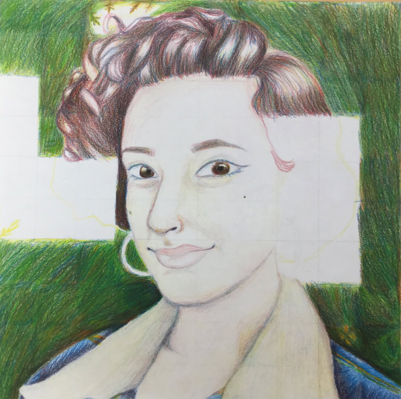
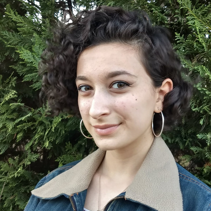
1. I believe my portrait was neat and true to the picture. I had trouble with the eyes and the skin tones and adding value to everything. My drawing of the denim on my jacket was very accurate and I enjoy the texture that the color pencils created on it; it looked very real! My favorite part has to be the whole jacket because I feel like I matched colors very well.
2. I had a lot of trouble with the hair color mixing and the skin tone mixing. My hair turned out too red-based and my skin was too light because I was afraid to add value to the skin tone. I didn’t want to look like a tomato. I also blended the background with a colorless blender but when i used it, it lightened the colors underneath and made the background lighter than I intended. That was the only time I used the blender. 3. I followed the directions for a little over ⅓ of the project, but when it got to the hair and the facial features I did trace first and then add color. I feel like I would have been more successful if I had followed the directions that whole time, but I just felt like I was going to ruin the drawing and I wanted it to look like me. 4. To create value changes, I made use of the pencils and the paper by leaving white space, for example on my skin there are places i left white or very close to white, and i also burnished all the dark areas and shadows in the hair and in the background. 5. It was very hard to match the colors from the picture by only using the three primary colors and I feel as if I could have done a better job than I did. The hair was the hardest part I think because brown was extremely hard to make and I couldn’t get my exact shade of brown. 6. I believe I could improve my portrait by adding more values. I feel that the piece is lacking, and looking at it from afar makes it more apparent especially in the skin. Looking at other people’s portraits I can see how they weren’t afraid to go dark and their values are much more realistic. 7. I believe I was prepared for the project, just not the amount of work that the project was gonna be. I had only worked with prismacolors once before on a project in art 1 and I didn’t even use them correctly back in the day. This project was definitely a more challenging one! 8. I absolutely loved Tori’s piece because even though she didn’t color match correctly, it looked very realistic; almost like you were seeing her picture through a kaleidoscope or something. It had a lot of style to it! Also, I’m pretty sure she went square by square which is a pretty amazing feat. These exercises really let me get used to the pencils in contest, whereas the cone and sphere were more of a broad help. Using the pencils to imitate a picture was very helpful because that was what our entire final project was!
0 Comments
Leave a Reply. |
AuthorSophomore at Apex High School Archives
June 2018
Categories |
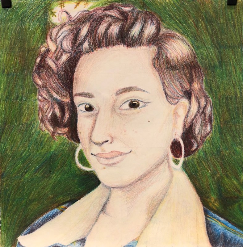
 RSS Feed
