0 Comments
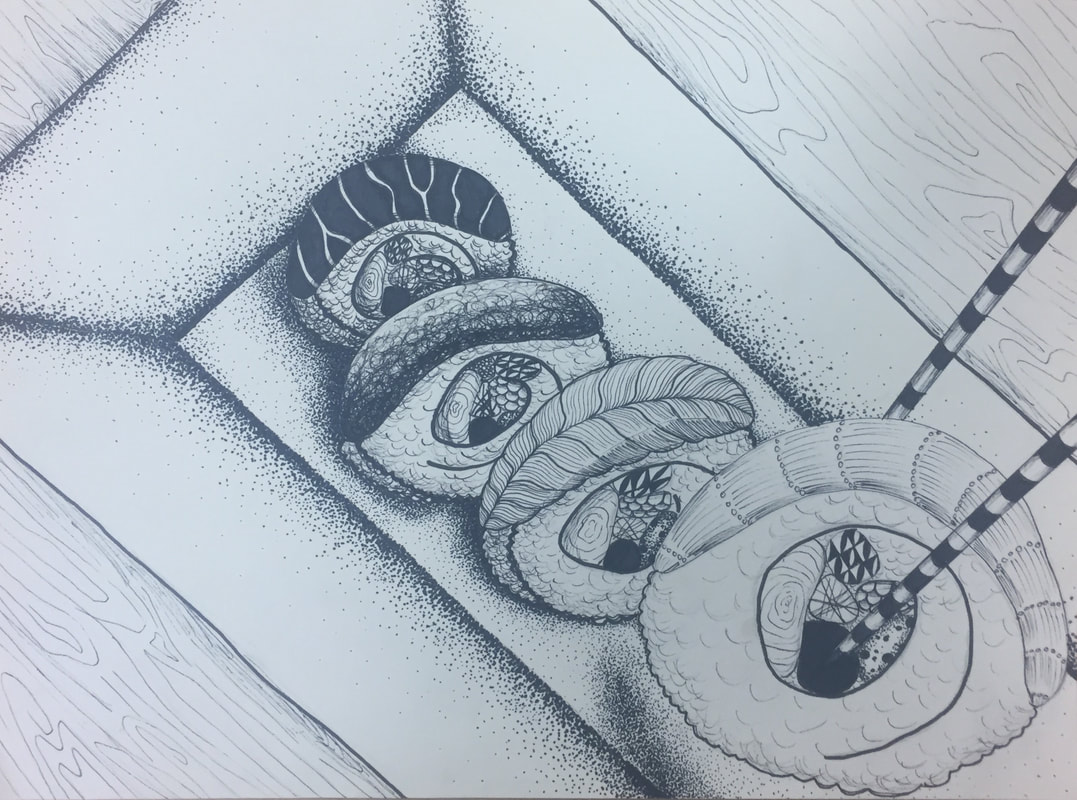
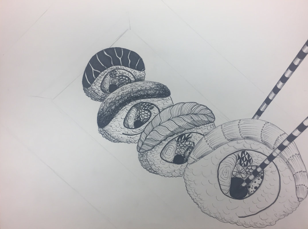
This exercise made me think about values of textures. In order to make the scene look 3-D, the darkest values had to be the objects furthest away. The objects closest had to be the lightest. I think I achieved that value contrast, but not as effectively as I had hoped. In the future, I will continue to push the shades so the contrast is more noticeable, therefore making the picture seem more real. 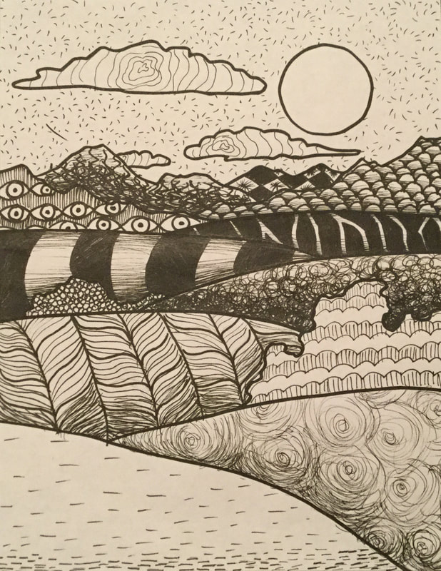 1. The first picture is the stippling worksheet. It was very tedious work, but I believe it paid off because I found the end result very pleasing. If I could do it again, I think I would add darker darks just to push the shading a little harder to make it more realistic or 3-D. 2. The second and third pictures are the pen value charts. I had done these in art 1 but it was fun to revisit them and they definitely turned out better than they did in art 1. The one that gave me the most trouble was the stippling because again it’s such delicate and tiring work, but as you can see in the third crosshatching square from the right, I forgot which direction I was hatching in and messed it up a little. 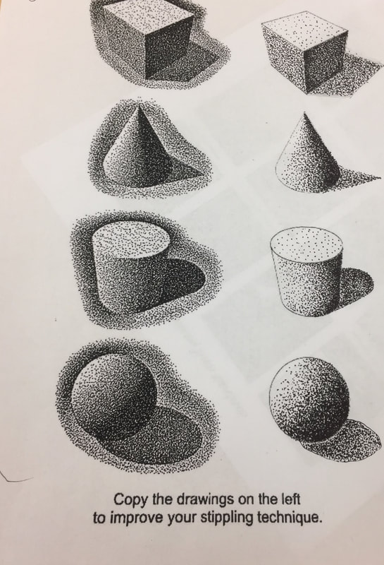 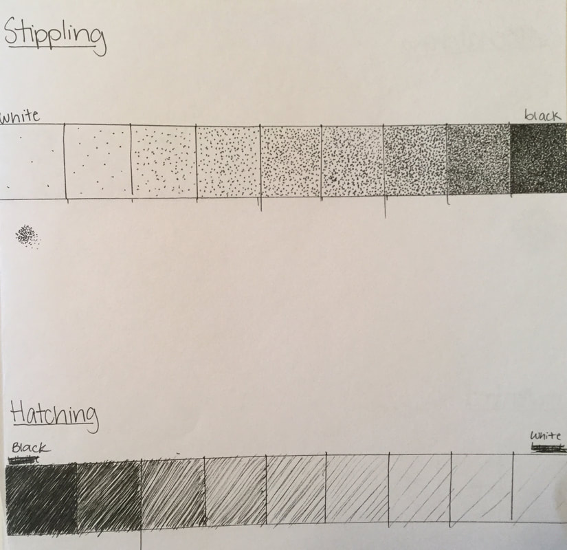 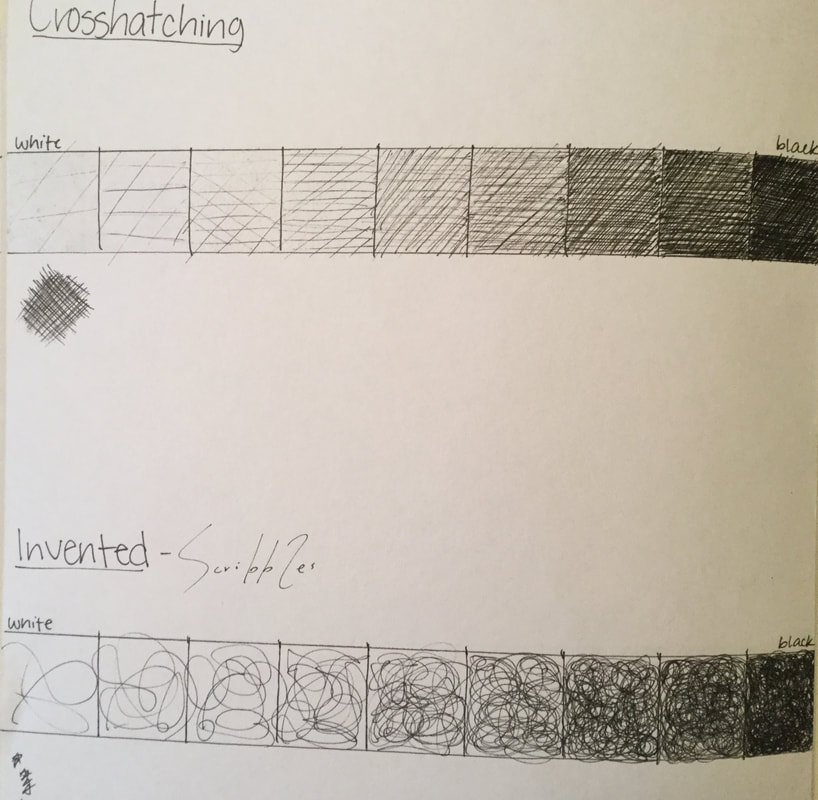 |
AuthorSophomore at Apex High School Archives
June 2018
Categories |
 RSS Feed
