1 Comment
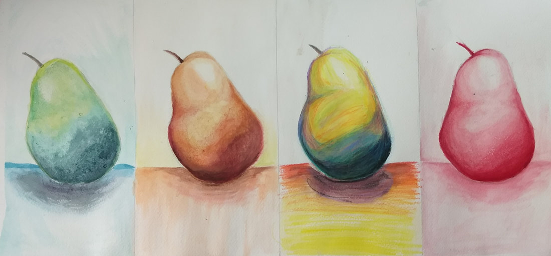 This piece was a lot of fun! You can tell that when I did the first pear I was still a little shaky in the watercolor ways but the difference between the first and second pear is pretty drastic I would say. I got a lot more comfortable by the time I did the second pear. You can’t really see the salt in the first pear, but it is in the dark part of the pear. My favorite one to do was the watercolor pencils. I think it looks very stylistic and fin compared to the others which are more traditional looking. Also, to have no color restrictions in the watercolor pear was really fun because I could just go crazy with the colors!
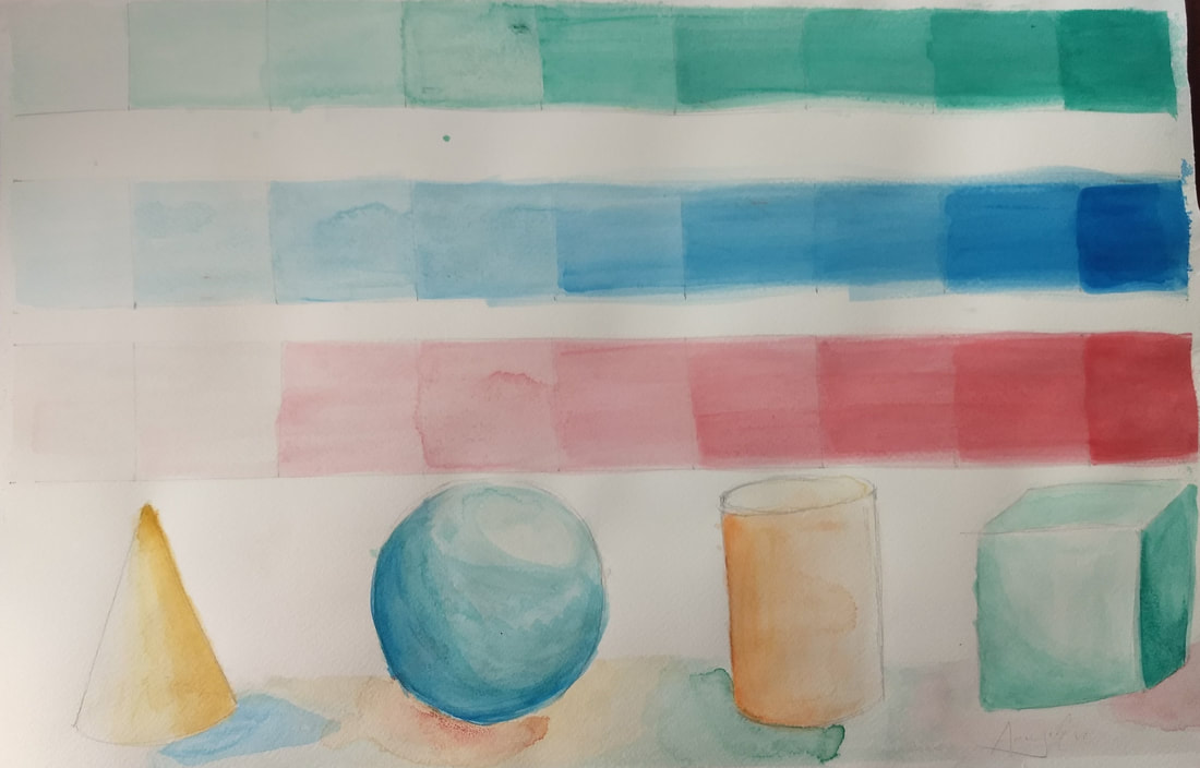 This practice, although it didn’t turn out great, was definitely worth it to do before anything big so I could work out the kinks in my technique before moving on to something like the fruits/veggies thing we did after. I had a hard time controlling how much water I used with the pigment, as seen in the blue and red value charts, where the paper had too much water in it before I added the paint
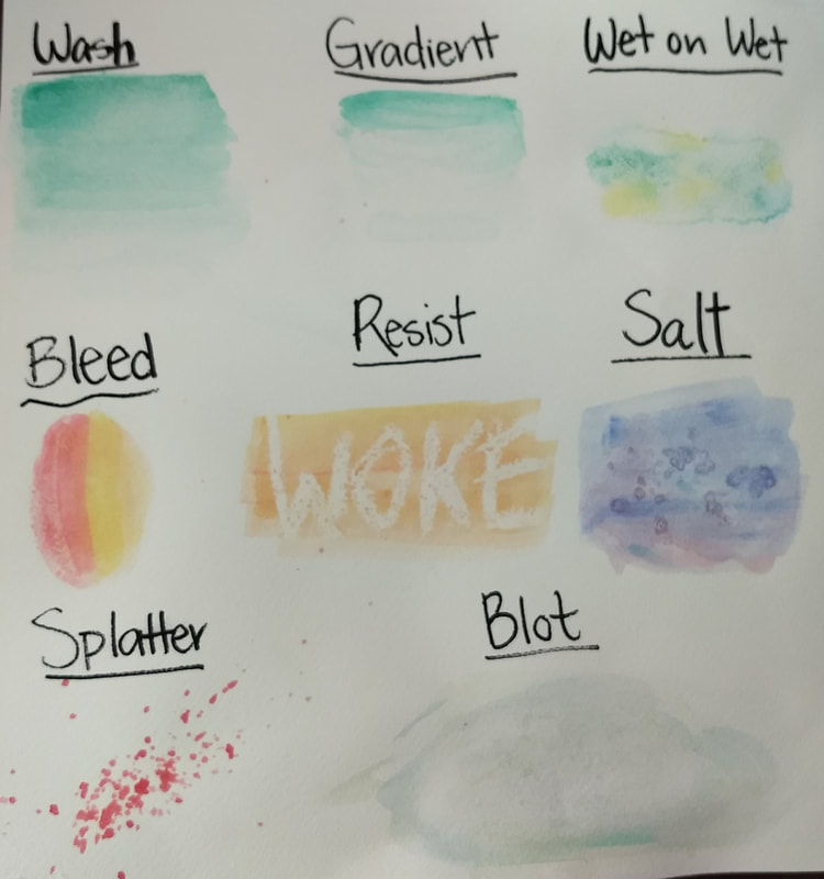 Doing a teacher-led practice was a great introduction to a new medium. A lot of people in my class including me hadn’t spent a lot of time painting with watercolor, and this helps us get a feel for the new medium without being an overwhelming task. I had a little trouble with this; I switched the was and gradient techniques and messed up the bleed by waiting too long before adding the second color, but I got a feel for the paints and I now know a lot of applicable techniques for further use.
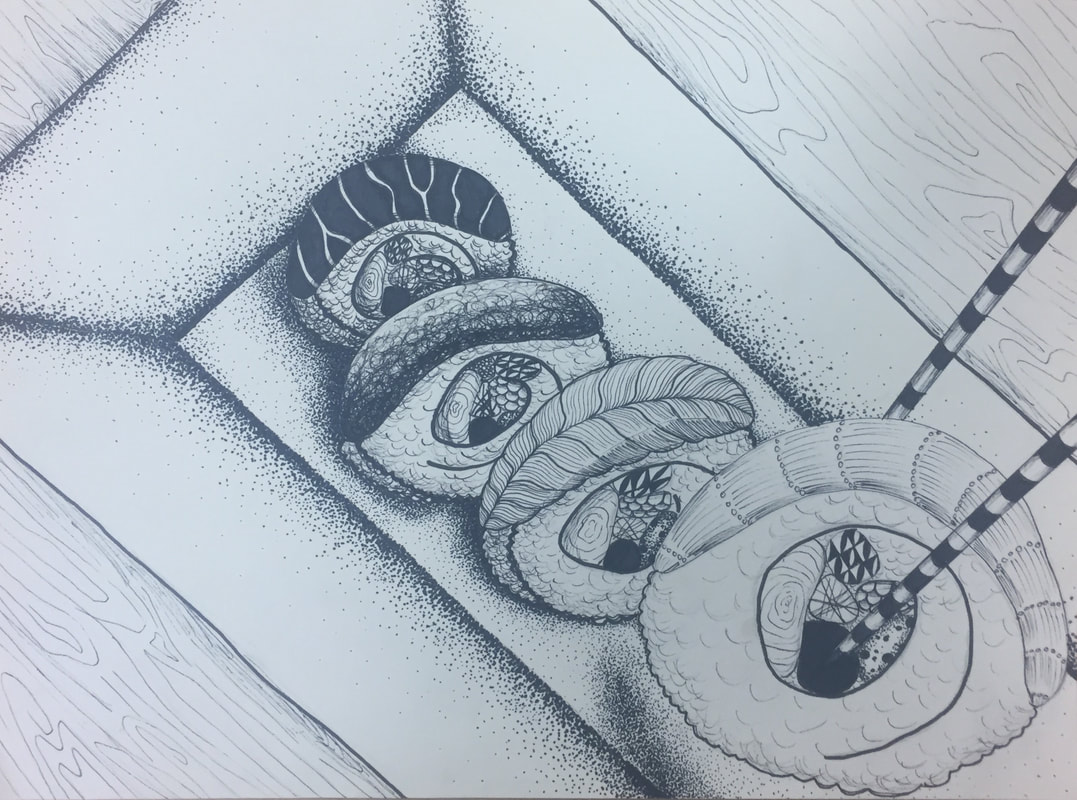
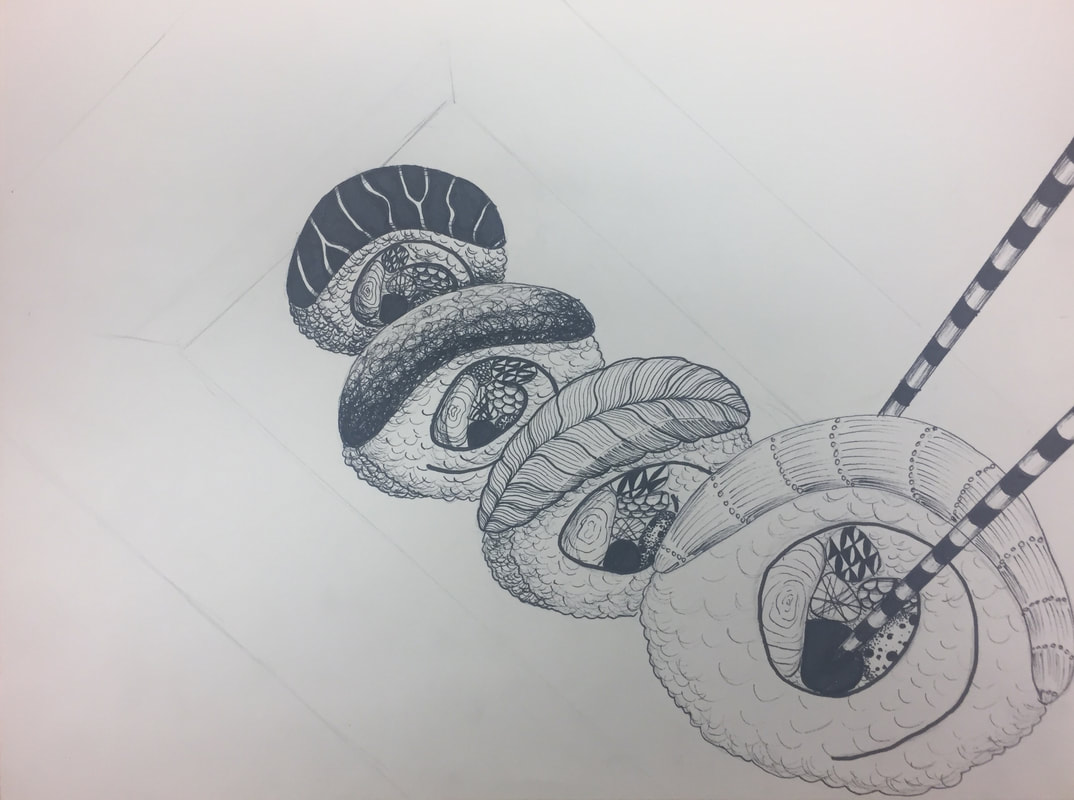
This exercise made me think about values of textures. In order to make the scene look 3-D, the darkest values had to be the objects furthest away. The objects closest had to be the lightest. I think I achieved that value contrast, but not as effectively as I had hoped. In the future, I will continue to push the shades so the contrast is more noticeable, therefore making the picture seem more real. 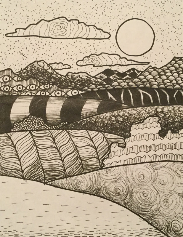 1. The first picture is the stippling worksheet. It was very tedious work, but I believe it paid off because I found the end result very pleasing. If I could do it again, I think I would add darker darks just to push the shading a little harder to make it more realistic or 3-D. 2. The second and third pictures are the pen value charts. I had done these in art 1 but it was fun to revisit them and they definitely turned out better than they did in art 1. The one that gave me the most trouble was the stippling because again it’s such delicate and tiring work, but as you can see in the third crosshatching square from the right, I forgot which direction I was hatching in and messed it up a little. 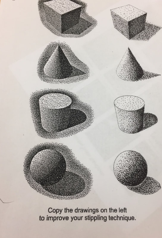 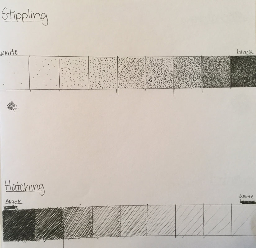 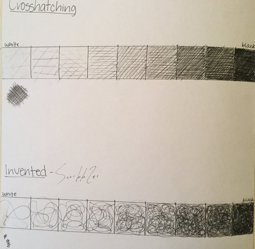 1. For the tree in a landscape I referenced a picture that included a cherry blossom tree and a small cypress behind it along with a couple of bushes. The hardest part was translating the individual flowers into drawing, so instead I used a mass of shape to indicate the flowers. 2. For the animal I drew a koi because I was thinking about textures and scales came to mind. It seemed easy to create and would look somewhat complicated. I had a lot of fun pushing darks and pulling lights to make the scales glisten. I feel I like I could have taken it further. The lily pads above the fish indicate it’s in a pond, but I don’t think I took enough time shading to really make it pop from the fish. 3. The street scene was difficult for me because I couldn’t remember how to do one point perspective, but I sort of adapted by zooming the picture in close to the streets so you only see the fronts of all the buildings. Shading was hard in this picture. 4. The hand was also difficult, but for me it was not as difficult as the street scene. I referenced my closed fist, and at first it looked very disproportionate, but when I was shading I used a stylized stroke that was sort of sketchy, and by the end, it looked kinda like a hand. 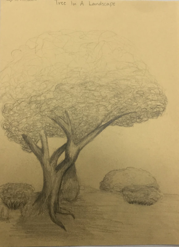 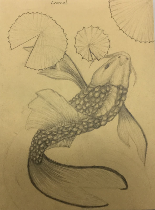 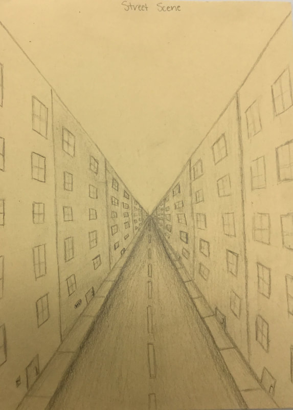 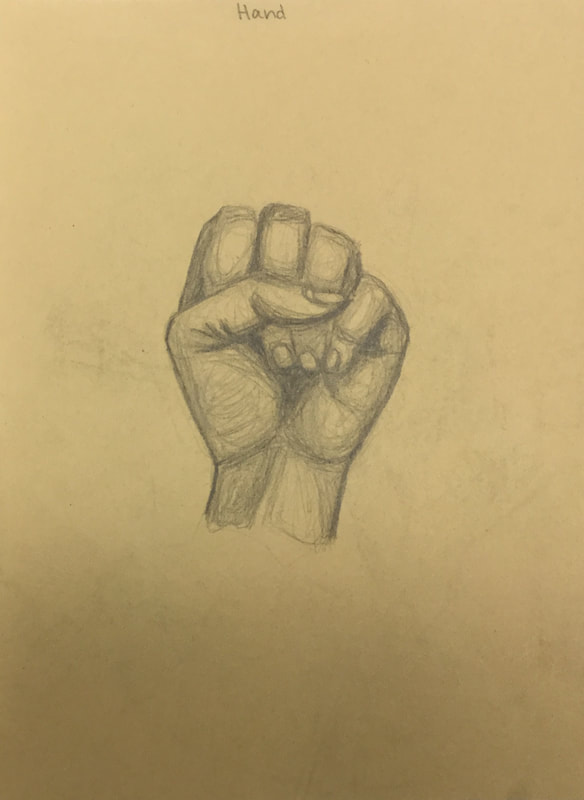 |
AuthorSophomore at Apex High School Archives
June 2018
Categories |
 RSS Feed
