0 Comments
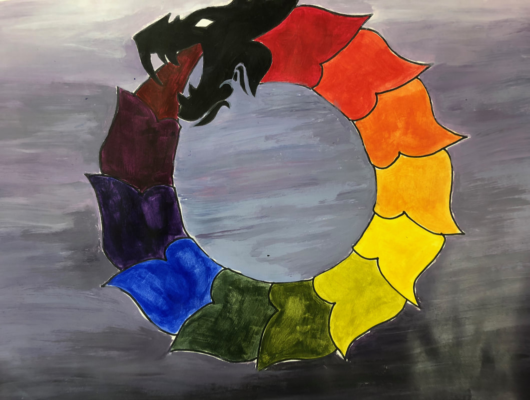 This is my acrylic color wheel. It is based on the mythical creature Ouroboros. I used the warm side of the primary colors for both this and my gradients below. The colors were easy to make for me, mostly because I have worked with acrylics before and I kinda had a little sense of what to do. The background is a very toned down blue-violet. I wanted it to look like it was flying in a sort of stormy sky. The gradients below I had very little trouble with besides the fact that the yellow turned into a sort of odd green when mixed with black which was kinda strange. I don't think it looks too bad though! 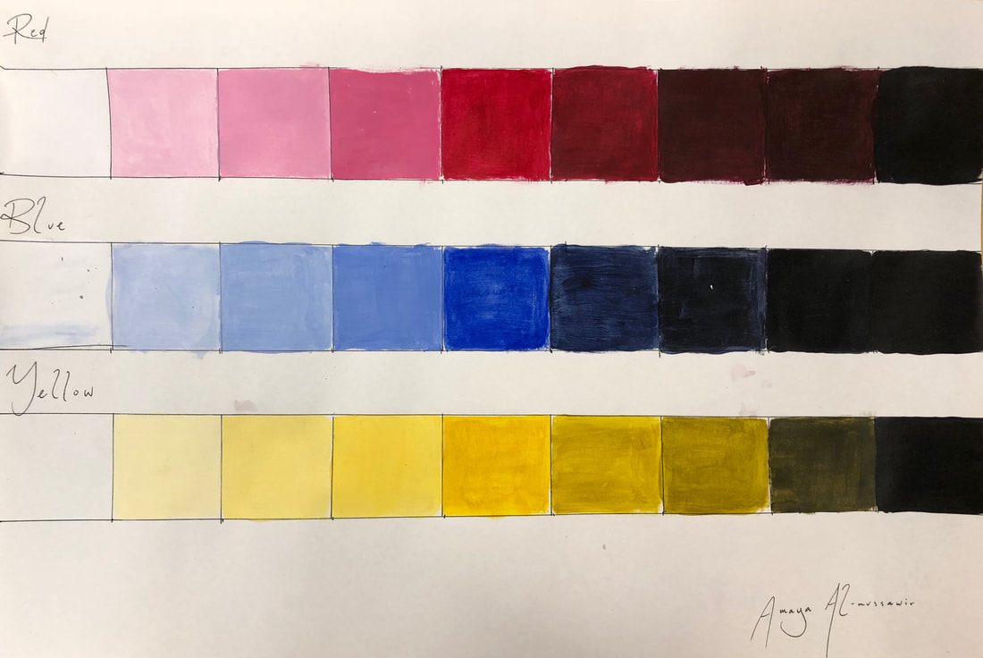
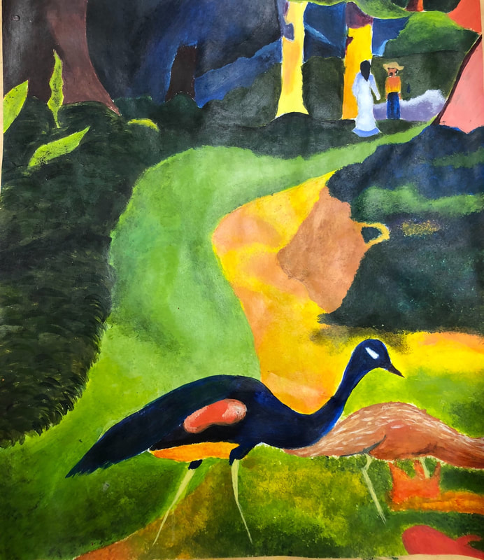
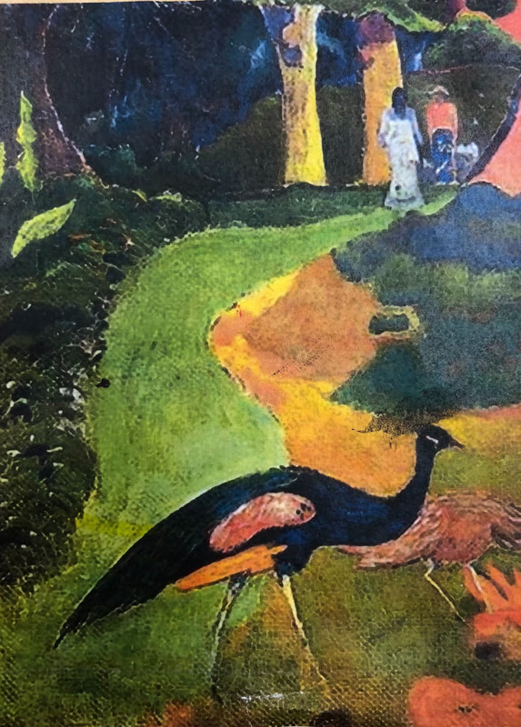
This is my piece of the Gauguin painting “Landscape with Peacocks”. I think I did alright on it, although some of my colors are too bright. The hardest part about this piece was that Gauguin mixed green with every color in his piece and while it looks pretty, it is such a hard task to recreate. I also was afraid to add blacks, but as you can see the piece needed the blacks to make it his style.
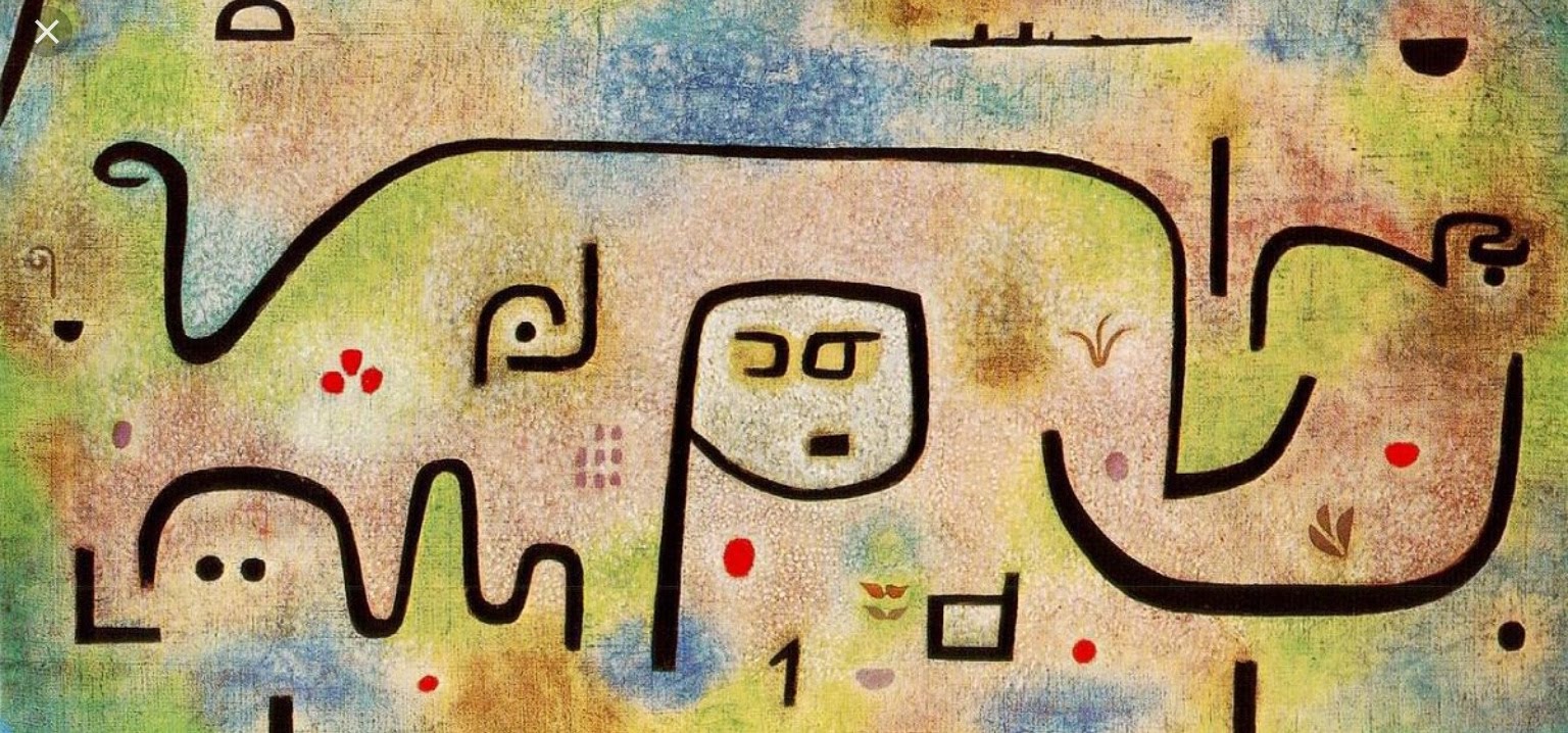
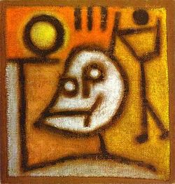
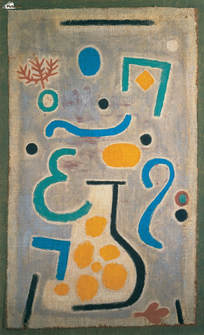
Paul Klee had a very diverse art career. He spanned multiple styles and multiple color schemes and could not be confined to one era of art. Instead, he had eras of his life. He would have a period of time when he would do mostly cubist art, then he would switch and do expressionism or surrealism or abstraction. Part of the success of his pieces is from the fact that he painted in so many different styles and could therefore appeal to a bigger audience. His works have a sense of dry humor and often childlike perspective, and he had a knack for capturing moods in his various styles. He would use differing color palettes and styles to create a wide array of moods. His art often had a childlike demeanor about it, but more often than not they would depict dark things and would contain political undertones or criticisms of Germany, where he lived. One example of that would be his piece Revolution des Viadukts, where the viaducts are separating from the bank and are in turn rioting. Another example would be his self portrait, titled von der Liste gestrichen, or in english “removed from the list”, in which his head is crossed out in the back, symbolizing how his art no longer had value in Germany. He painted it with a harsh expression and used very dark colors to also portray his mood. 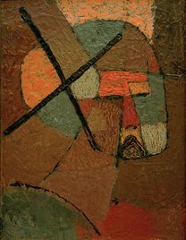 He also often used hieroglyphic elements in his pieces, with the pieces being light colors and the hieroglyphs being brighter or dark in comparison. This technique can be seen in his pieces Tod und Feuer, or death and fire, and also Die Vase. Incorporating this technique into a landscape could prove very interesting. Using this style with a monochromatic element could also be very fascinating, although rather difficult. I must find a landscape that could be deconstructed into simple lines, that way I could mess around with the colors and the mood of the piece, as did Paul Klee in his pieces.
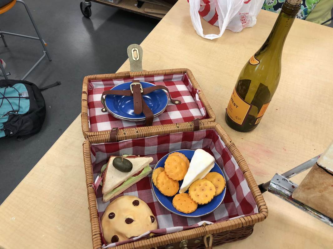
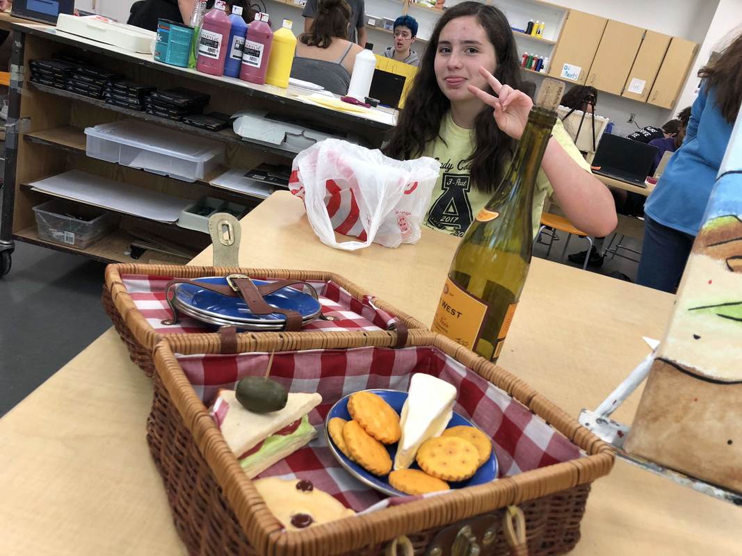
This is the Prismacolor color wheel. This was my introduction to the art of the colored pencils. As you can tell, I had trouble blending the colors because I didn’t realize that if you draw too dark with the first color that it doesn’t blend in with the color you put on top. The realizaion that so many different colors could be made in various shades by applying different amounts of pressure very much helped my final Prismacolor piece. 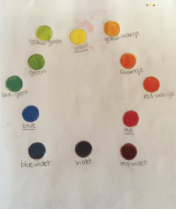 Here are my brainstorm ideas. The ones in boxes were the ideas I liked and the ones with stars in the bubbles are the ones i ended up drawing concept sketches for. 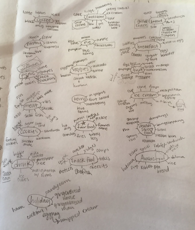 These are my two concept sketches. To be honest, I liked the fair food idea Better before I made the sketches, and the I realized there would be too many browns so I chose the more vibrant, natural option.  
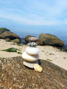
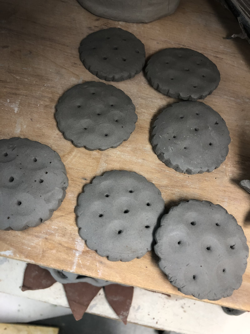
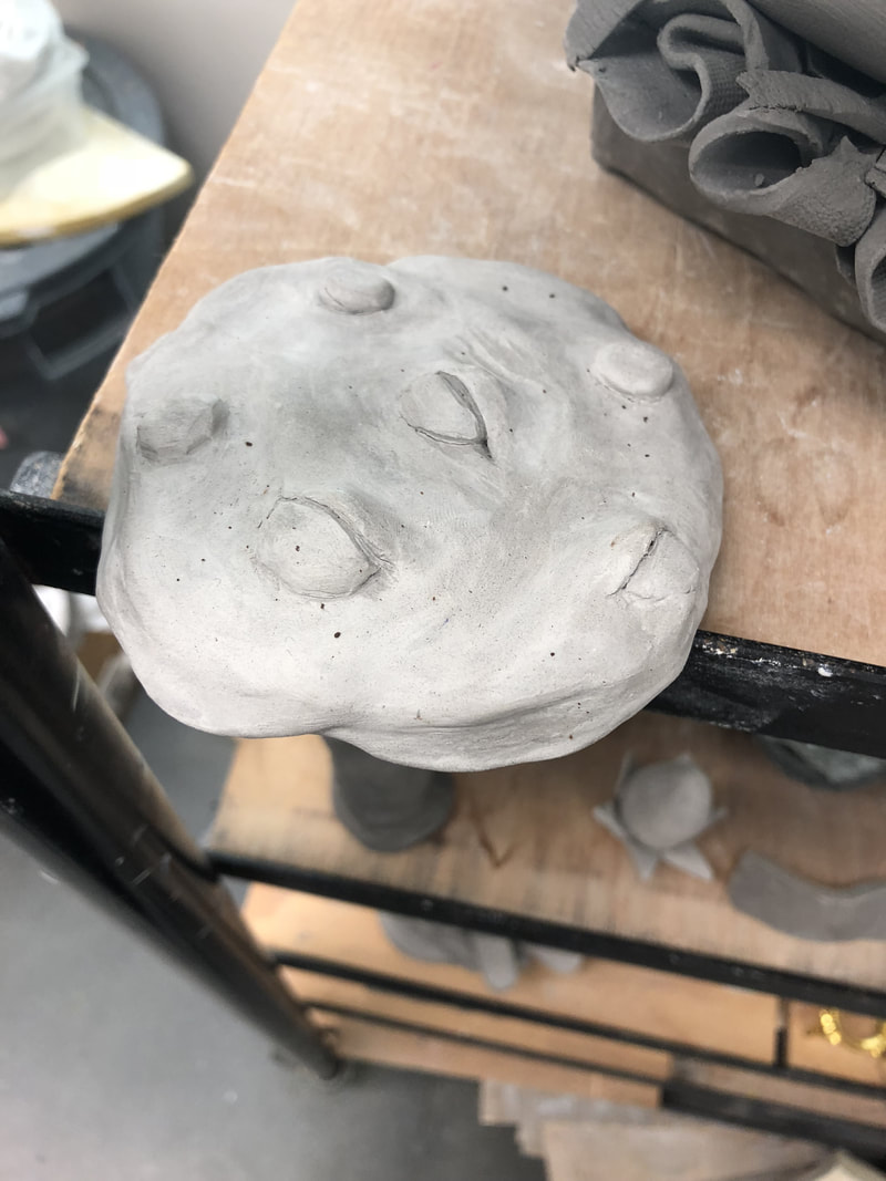
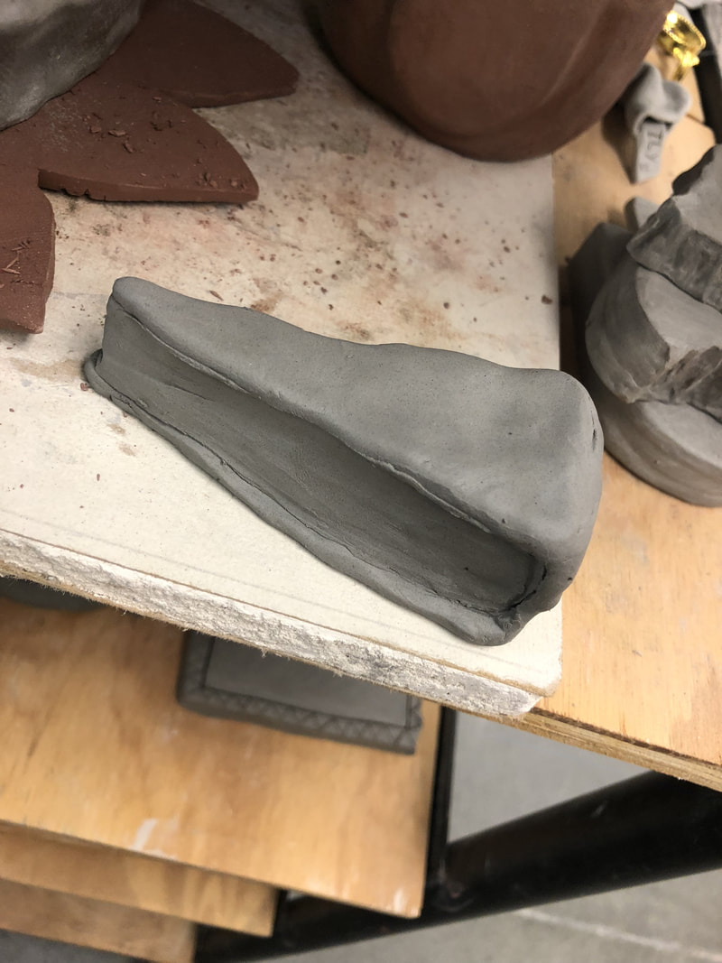
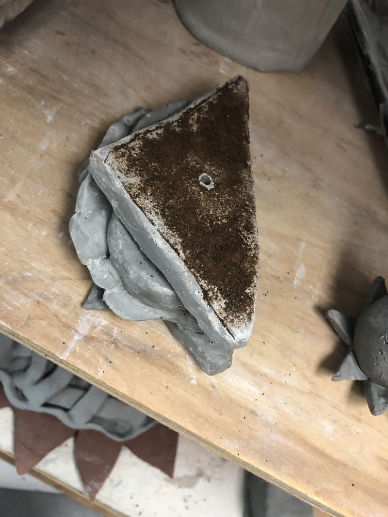
The hardest thing to create I think was the sandwich. it required layers and the lettuce was very fragile and kept breaking. I feel like it turned out okay, and I'm excited to paint it! I like the way the cookie looks home made, and I think I am gonna glaze the chocolate chips so that they look melted, and then use acrylic for the rest of the cookie. I also think I will glaze the inside part of the cheese so it's shiny.
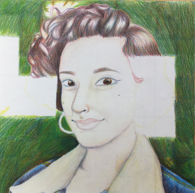
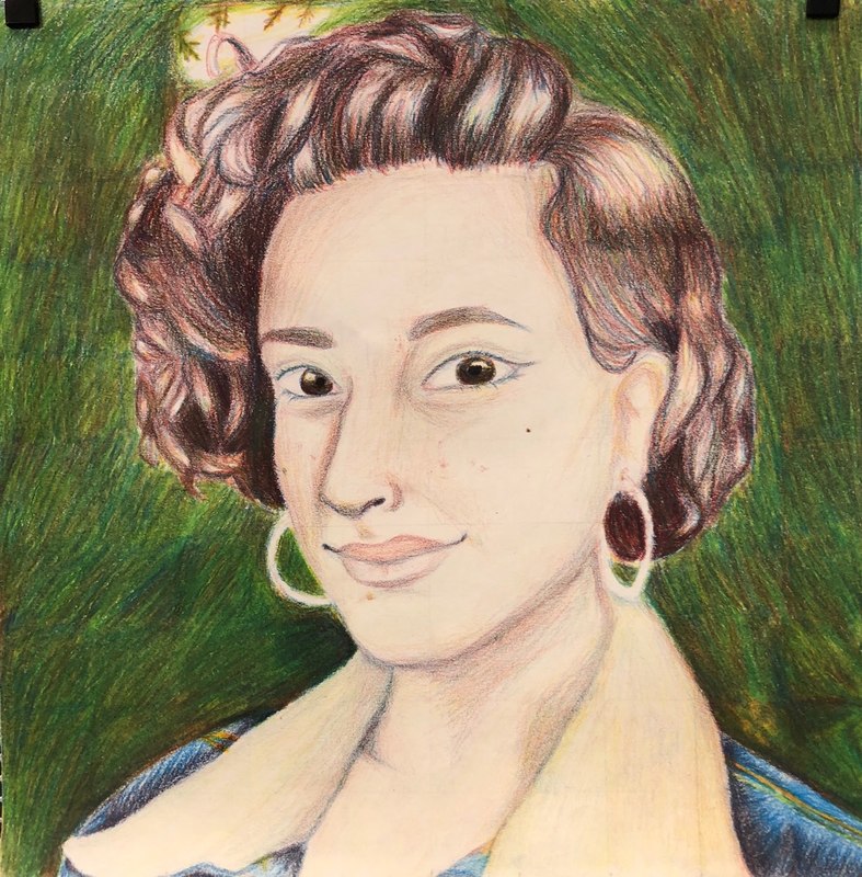
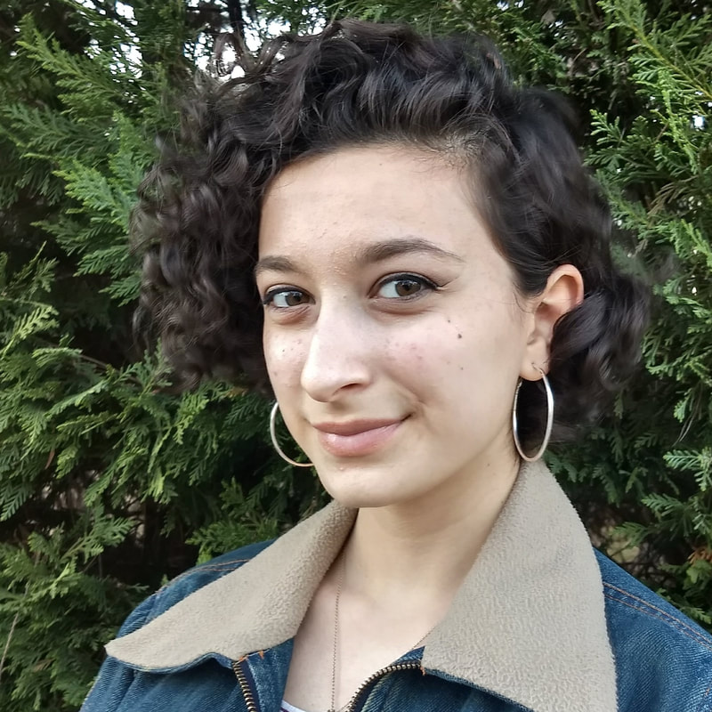
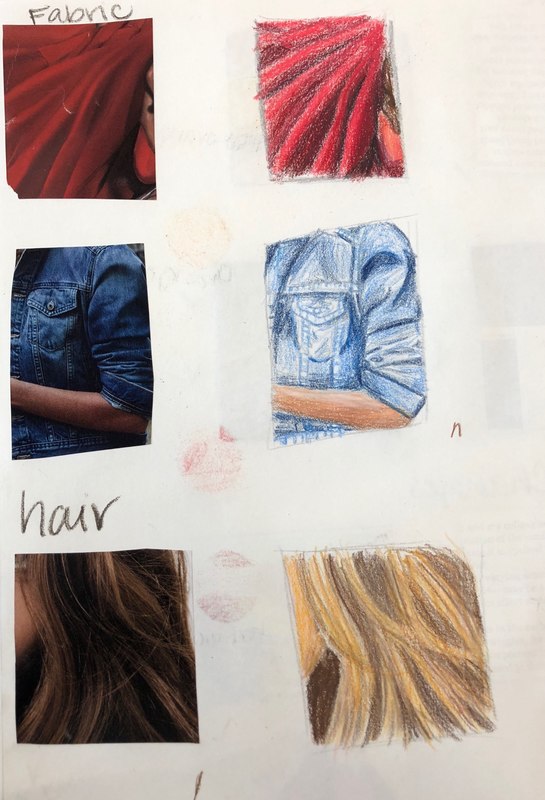
1. I believe my portrait was neat and true to the picture. I had trouble with the eyes and the skin tones and adding value to everything. My drawing of the denim on my jacket was very accurate and I enjoy the texture that the color pencils created on it; it looked very real! My favorite part has to be the whole jacket because I feel like I matched colors very well.
2. I had a lot of trouble with the hair color mixing and the skin tone mixing. My hair turned out too red-based and my skin was too light because I was afraid to add value to the skin tone. I didn’t want to look like a tomato. I also blended the background with a colorless blender but when i used it, it lightened the colors underneath and made the background lighter than I intended. That was the only time I used the blender. 3. I followed the directions for a little over ⅓ of the project, but when it got to the hair and the facial features I did trace first and then add color. I feel like I would have been more successful if I had followed the directions that whole time, but I just felt like I was going to ruin the drawing and I wanted it to look like me. 4. To create value changes, I made use of the pencils and the paper by leaving white space, for example on my skin there are places i left white or very close to white, and i also burnished all the dark areas and shadows in the hair and in the background. 5. It was very hard to match the colors from the picture by only using the three primary colors and I feel as if I could have done a better job than I did. The hair was the hardest part I think because brown was extremely hard to make and I couldn’t get my exact shade of brown. 6. I believe I could improve my portrait by adding more values. I feel that the piece is lacking, and looking at it from afar makes it more apparent especially in the skin. Looking at other people’s portraits I can see how they weren’t afraid to go dark and their values are much more realistic. 7. I believe I was prepared for the project, just not the amount of work that the project was gonna be. I had only worked with prismacolors once before on a project in art 1 and I didn’t even use them correctly back in the day. This project was definitely a more challenging one! 8. I absolutely loved Tori’s piece because even though she didn’t color match correctly, it looked very realistic; almost like you were seeing her picture through a kaleidoscope or something. It had a lot of style to it! Also, I’m pretty sure she went square by square which is a pretty amazing feat. These exercises really let me get used to the pencils in contest, whereas the cone and sphere were more of a broad help. Using the pencils to imitate a picture was very helpful because that was what our entire final project was!
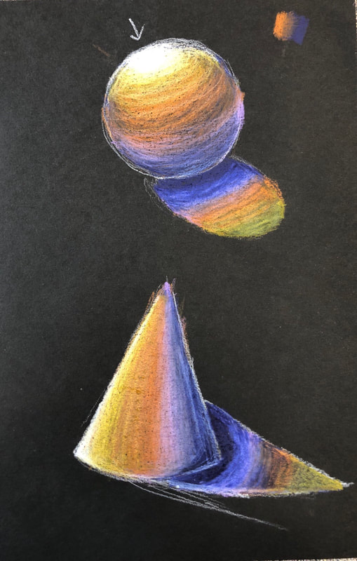
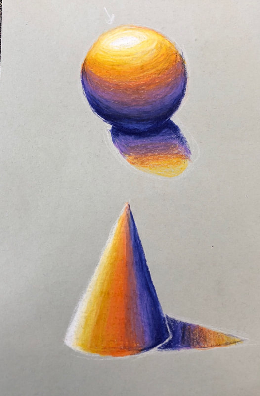
You can tell that I did the black paper one first, as I am not comfortable yet with blending. I got better by the second attempt, though, and I believe the sphere on the gray paper turned out alright! This exercise taught me how to use shadows and overall value to my advantage and also how to blend the pencils together nicely.
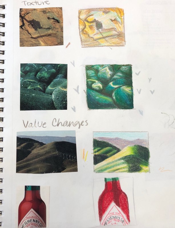
These were very hard for me because the medium was new and we had to copy realism; although it was a nice push right into how to manipulate the pencils to create realism, which we used in our final piece. I think my favorite of these is the underwater rocks. I think I matched the colors really well!
|
AuthorSophomore at Apex High School Archives
June 2018
Categories |
 RSS Feed
